Exploring Assets
The Explore tab in the Strategy Lab lets you research an asset before creating a strategy for it.
Selecting an Asset
Section titled “Selecting an Asset”Choose from the available EUR trading pairs on your connected exchange. When you select an asset:
- Aurono automatically fetches historical price data (daily candles)
- Extended history loads in the background for deeper analysis
- Charts and indicators update as data arrives
No manual “fetch data” step is needed.
What You See
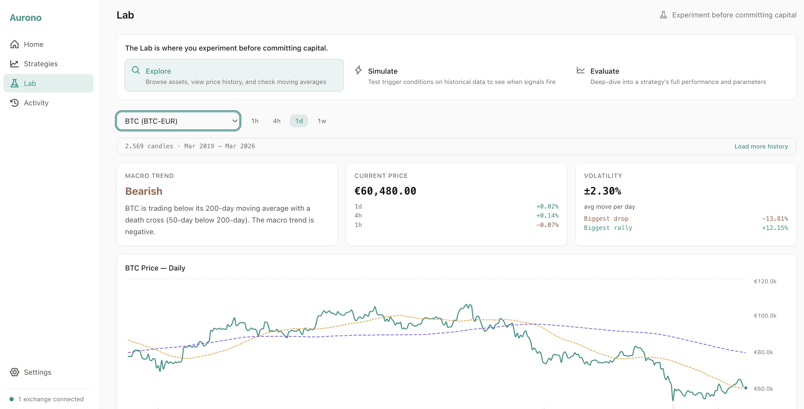
Section titled “What You See”The Explore tab uses a regime-first hierarchy: the most important information - the macro regime - appears at the top, before any charts.
Regime Summary (first thing you see)
Section titled “Regime Summary (first thing you see)”A prominent card at the top shows the current market regime in plain language:
- A large, colour-coded label: Bullish, Bearish, Ranging, Overbought, or Oversold
- A human-readable sentence explaining what the label means for this asset
This gives you the headline at a glance - you don’t need to interpret charts to understand the macro picture.
Price & Volatility Stats
Section titled “Price & Volatility Stats”Below the regime card, two stat cards show:
- Current Price - with percentage changes over the last 1h, 4h, and daily candles
- Volatility - average price move per period, biggest drop, and biggest rally
Price Chart
Section titled “Price Chart”A candlestick chart showing the asset’s price history with:
- 50-day moving average - short-term trend
- 200-day moving average - long-term trend
RSI (Relative Strength Index)
Section titled “RSI (Relative Strength Index)”RSI shown below the price chart:
- Above 70 - potentially overbought
- Below 30 - potentially oversold
- Between 30-70 - neutral range
MACD chart (12, 26, 9) shown below RSI for momentum analysis.
Regime Classification Details
Section titled “Regime Classification Details”The regime label is based on simple, transparent rules:
| Regime | Meaning |
|---|---|
| Bullish | Price above both moving averages |
| Bearish | Price below both moving averages |
| Ranging | Price between moving averages |
| Overbought | RSI above 70 (overrides bullish) |
| Oversold | RSI below 30 (overrides bearish) |
These labels help you form an opinion - they are not trading signals.
Timeframe Views
Section titled “Timeframe Views”Switch between timeframes to see different perspectives:
- 1h - short-term noise and patterns
- 4h - intraday trends
- 1d - daily picture (default)
- 1w - weekly macro view
Each timeframe shows its own chart with timeframe-appropriate indicators.
What to Do Next
Section titled “What to Do Next”After exploring an asset, you have two options:
- Create strategy - pre-fills the symbol and timeframe in the strategy creation form
- Simulate - switch to the Simulate tab to test strategy parameters against historical data
If Data Is Insufficient
Section titled “If Data Is Insufficient”Some assets may not have enough history for all indicators:
- The 200-day moving average requires at least 200 days of data
- Weekly charts require several months of history
Aurono shows what is available and indicates when data is insufficient.